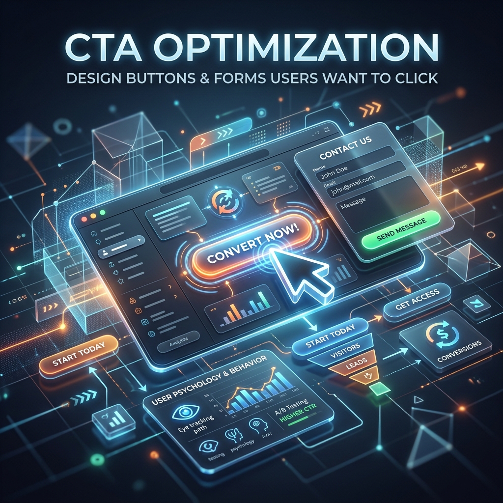
Call to Action (CTA) Optimization: Engineering the Click in 2026
The Call to Action (CTA) is the tipping point between a bounce and a conversion. It is the button, the form, or the link where the actual transaction occurs.
Even if your SEO is perfect, your Core Web Vitals are flawless, and your page design is beautiful, a weak CTA will destroy your conversion rate. In 2026, user attention spans are heavily fragmented, meaning your CTA needs to be frictionless, hyper-relevant, and visually commanding.
Button Design and Psychology: Making It Unmissable
Your primary CTA button must stand out from everything else on the page while still feeling integrated into your UI.
1. The "Squint Test"
If you step back from your monitor and squint so the screen becomes blurry, the CTA button should be the only thing you can clearly identify. It must use a high-contrast color that isn't excessively used anywhere else in your branding (often called the "isolation effect").
2. Action-Oriented Copy (The "I Want To..." Rule)
Never use generic words like "Submit" or "Click Here". In 2026, users expect personalization. The button text should complete the user's implicit sentence: "I want to..."
- Bad: Submit
- Okay: Get SEO Audit
- Great: Analyze My Website Now
- Great: Start My 14-Day Free Trial
3. Leverage Click Triggers
Add a micro-copy line directly underneath the button to reduce anxiety. Modern users are skeptical about hidden costs or spam.
- "No credit card required."
- "Unsubscribe at any time."
- "Join 150k+ marketers."
Form Optimization: The Art of Asking for Less
Every input field you add to a form drastically reduces the percentage of people who will fill it out. Data from 2026 shows that dropping from 4 fields to 3 can increase conversions by up to 50%.
If you are a B2B SaaS company and your "Book a Demo" form requires First Name, Last Name, Email, Phone Number, Company Name, Company Size, and a message... you are losing 80% of your potential leads.
The Golden Rule of Forms: Only ask for the absolute minimum information required to move to the next step.
Progressive Profiling
Instead of asking for everything upfront, use progressive profiling. If you only really need an email address to create an account, only ask for an email address. You can collect their name and company size later during the onboarding process or through automated data enrichment tools.
The Decoy Effect (Pricing Pages)
When designing a pricing page CTA, humans struggle to evaluate absolute value. They are much better at evaluating comparative value.
If you offer a $50/month Pro plan and a $500/month Enterprise plan, the jump is too high. Most people will buy nothing, or choose the cheapest option.
The Fix: Introduce a "Decoy". Offer a $45/month Basic plan (with very few features), a $50/month Pro plan (with all features), and the $500 Enterprise plan. The user compares the $45 to the $50, realizes the $50 plan is an incredible deal, and clicks "Buy Pro".
Actionable Next Steps
- Run the Squint Test: Open your highest-traffic landing page. Does your CTA stand out?
- Audit Your Forms: Remove at least one field from your primary lead generation form today.
- A/B Test Micro-copy: Test adding an anxiety-reducing click trigger below your main CTA button.