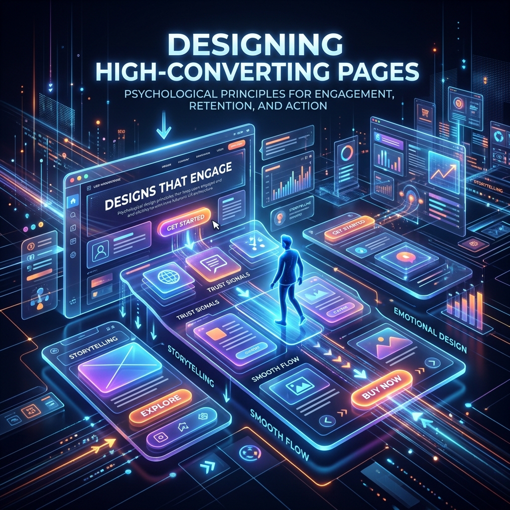
Designing High-Converting Pages
A high-converting landing page is not an accident. It is meticulously engineered using established principles of human psychology, visual hierarchy, and user intent.
In 2026, when a user lands on your page, you have roughly 2 to 3 seconds to convince them to stay. If your value isn't immediately obvious, they will hit the "Back" button and visit your competitor.
The "Above the Fold" Experience
"Above the fold" refers to the portion of the website visible before the user has to scroll down. This is the most valuable real estate on your entire website. It must contain three distinct elements:
- The Value Proposition (H1): A crystal clear, instantly readable headline that explains exactly what you do and how it benefits the user. Do not be clever; be clear.
- Bad: "Synergizing holistic enterprise solutions for the modern era."
- Good: "The easiest way to track employee time and run payroll."
- The Subheadline: A 1-2 sentence paragraph supporting the H1 with specific details, data, or secondary benefits.
- The Primary Hero Image or Video: A high-quality, lightweight visual showing your product in action or your customer experiencing the desired result. In 2026, subtle CSS animations and lightweight WebM videos work best for retaining attention without sacrificing load speed.
Visual Hierarchy and Modern Scanning Patterns
Eye-tracking studies show that users do not read websites; they scan them. While the traditional "F-pattern" is still relevant for text-heavy pages, modern web design often utilizes the "Z-pattern" or alternating layouts.
How to design for optimal scanning:
- The Z-Pattern: Place your logo top-left, your primary CTA top-right, followed by a diagonal line down to your core value proposition and another CTA.
- Whitespace is Your Friend: Give your elements room to breathe. Cluttered pages increase cognitive load and bounce rates.
- Directional Cues: Use subtle visual cues (like arrows, lines, or even an image of a person looking toward your CTA) to guide the user's eyes exactly where you want them.
Hick's Law: The Paradox of Choice
Hick's Law states that the time it takes for a person to make a decision increases logarithmically as the number of choices increases.
If you give a user 15 different links to click, they will become overwhelmed, suffer from analysis paralysis, and click nothing.
The Fix: A high-converting landing page should have exactly one primary goal (a 1:1 attention ratio).
- Remove the massive top navigation bar on dedicated landing pages.
- Remove the footer links.
- Remove the social media icons.
- If the goal of the page is to get them to book a demo, every single button on that page should lead to the exact same "Book a Demo" form.
Cognitive Fluency and Readability
If your text is hard to read, users will assume your product is hard to use.
- Font Size: Ensure your body text is at least 16px (18px or 20px is even better for modern high-resolution displays).
- Contrast: Never use light gray text on a white background. Ensure high contrast.
- Chunking: Break large walls of text into bulleted lists, short paragraphs (2-3 sentences max), and bolded keywords.
Actionable Next Steps
- The 3-Second Test: Show your landing page to someone who doesn't know your business for exactly 3 seconds. Ask them what the page is about. If they don't know, rewrite your H1.
- Audit Your Links: Count the number of clickable links on your primary landing page. Try to reduce that number by 50%.
- Check Mobile Hierarchy: Ensure your "Above the Fold" content remains intact and compelling when viewed on a mobile device.